1291
What Building an Intuitive Bike Sharing App Looks Like
2 min read

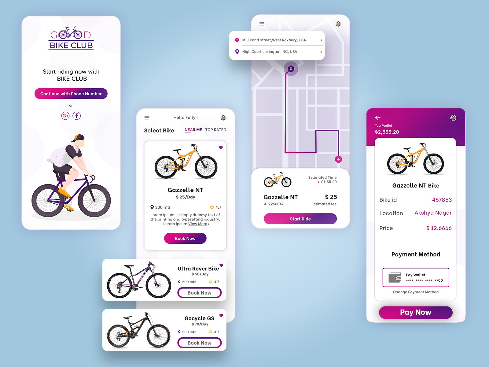
Harry is a typical salesperson. He has to move around in the city at least thrice a day. He found out there’s a bike-sharing app. It’s quick and easy. Now, whenever he has to take a trip, he books a bike, uses a Qr code to unlock it, pays for the ride, and drives away.
That’s the ideal user of your bike-sharing app. The user’s intent to use bike-sharing apps is quite simple – locate the nearest bike in real-time, book one, and reach the destination as quickly as possible. If it’s too complicated then it can leave the user frustrated.
This means, designing a bike-sharing app is not just about how it looks but how it functions. User-centric apps like these need the most ideation. You need to go through hundreds of ideas and share them with users to seek feedback. The process continues till you get a refined idea to capitalize on.

We can help you develop proper prototypes that will give you the end-to-end flow of various functions of your app. Let’s get in touch to see how the eventual product will look like.
All product and company names are trademarks™, registered® or copyright© trademarks of their respective holders. Use of them does not imply any affiliation with or endorsement by them.